
Brand Creation, Identity & Digital
ZTAYO
From an idea to a complete brand experience.
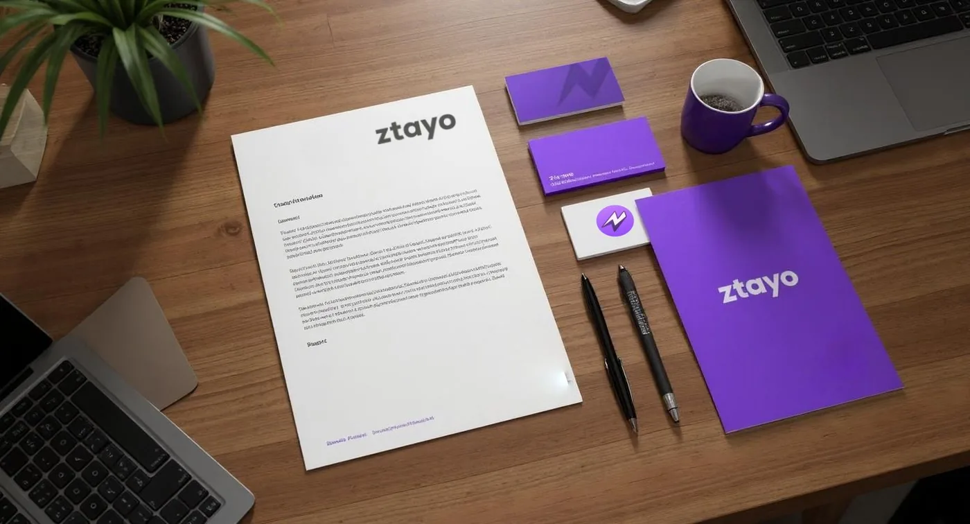
One brand idea. A consistent system across every expression.
- Client
- ZTAYO, a hospitality brand for stays and property management.
- Engagement
- Zero to One. Strategy & Identity, Digital & Experiences, Campaigns & Content.
- Pixnut’s role
- Positioning, voice, identity, guidelines, brochure, marketing and creative direction, website design and development.
- Status
- Live at ZTAYO.com.
The question
What does a hospitality brand need when nothing about it exists yet?
Project
The brief.
ZTAYO is a hospitality brand Pixnut built from zero: its positioning, voice, visual identity and guidelines, the “You need a break” campaign, and the website.
A zero-to-one assignment: nothing existed yet, so every part of the brand had to be decided, from what it stands for and how it speaks to how guests would first meet it.
- Brand development, positioning and communication
- Brand voice
- Visual identity: the Z symbol, wordmark, colour and typography
- Brand guidelines
- Marketing and creative direction, including the “You need a break” campaign
- Website design and development
Brand thinking
Key decisions.
- The symbol
- A Z that merges with a lightning bolt, for energy and momentum, with a hint of a mountain peak for elevation.
- The voice
- Confident, clear and approachable. The guidelines themselves are written in it.
- Colour and type
- A bright primary purple (#8830FF) grounded by a deep purple (#341263); Lexend for headings, Poppins for text.
- Rules
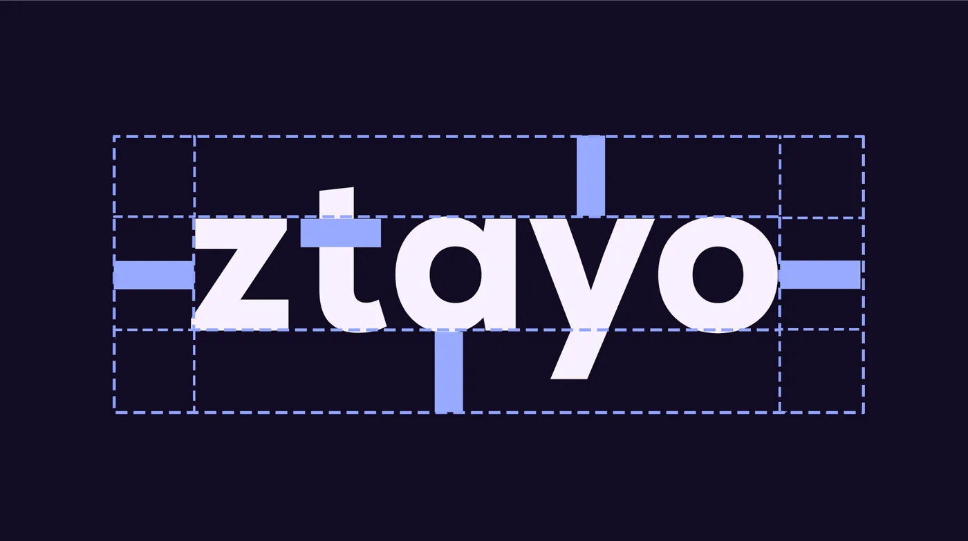
- Clear space, contrast-use logotypes, partner lock-ups and a list of things to avoid, so the identity holds as it spreads.
Identity
The marks.

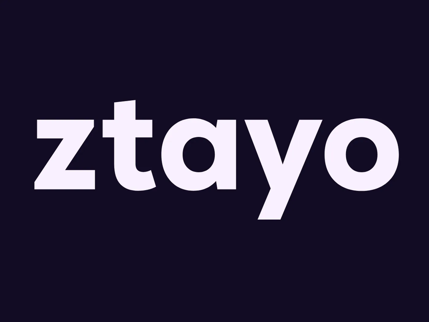
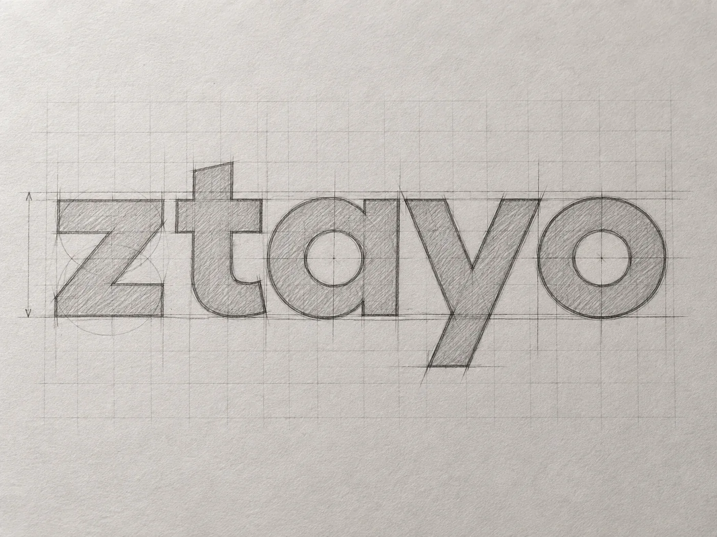
LogoSymbol and wordmark, locked up. 
SymbolA Z merged with a lightning bolt.
The system
Two purples, two typefaces, clear rules.
What lets the identity hold on a billboard, a key card and a booking site alike.
Colour
- Primary purple
#8830FFEnergy: the symbol and key moments. - Deep purple
#341263Grounding: backgrounds and depth.
Type
- LexendHeadings and emphasis.
- PoppinsBody text, with a defined hierarchy.
What the guidelines rule out

Don't stretch it 
Don't add effects 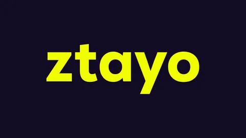
Don't recolour the wordmark 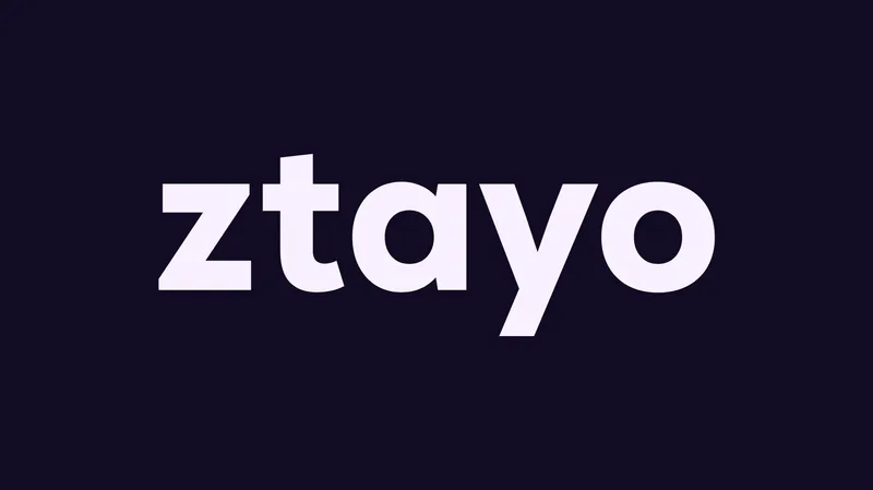
Use the wordmark as drawn
From the ZTAYO brand guidelines Pixnut wrote and delivered.
Visual language
The rules, end to end.
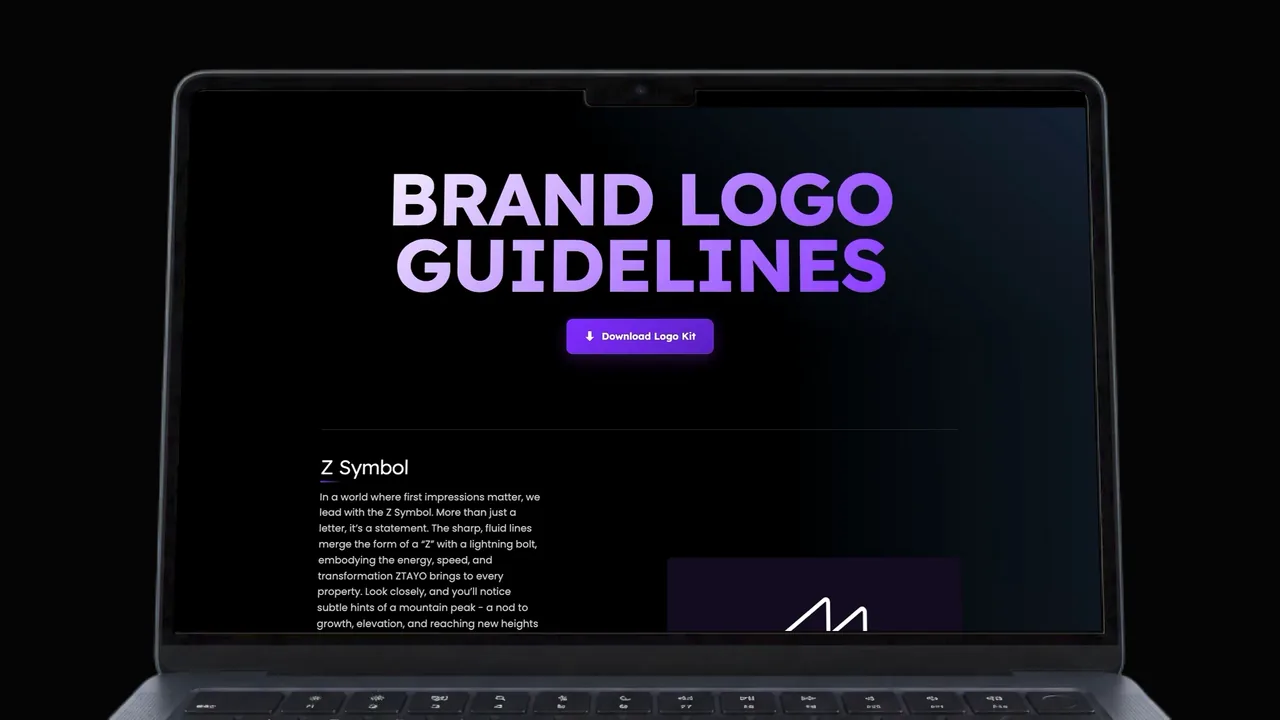
About this website
The ZTAYO brand guidelines Pixnut wrote, published as a website: the Z symbol and its meaning, the wordmark, the two purples, the Lexend and Poppins pairing, clear space, contrast-use logotypes, partner lock-ups, things to avoid, and applications from the billboard to the room key card.
The website
The identity, live.
Sections of ZTAYO.com, the website Pixnut designed and built, as it runs today.
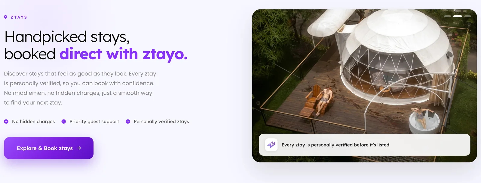
One promise, first
The homepage leads with what a guest gets, in the brand’s two purples and Lexend, with the campaign artwork beside it.
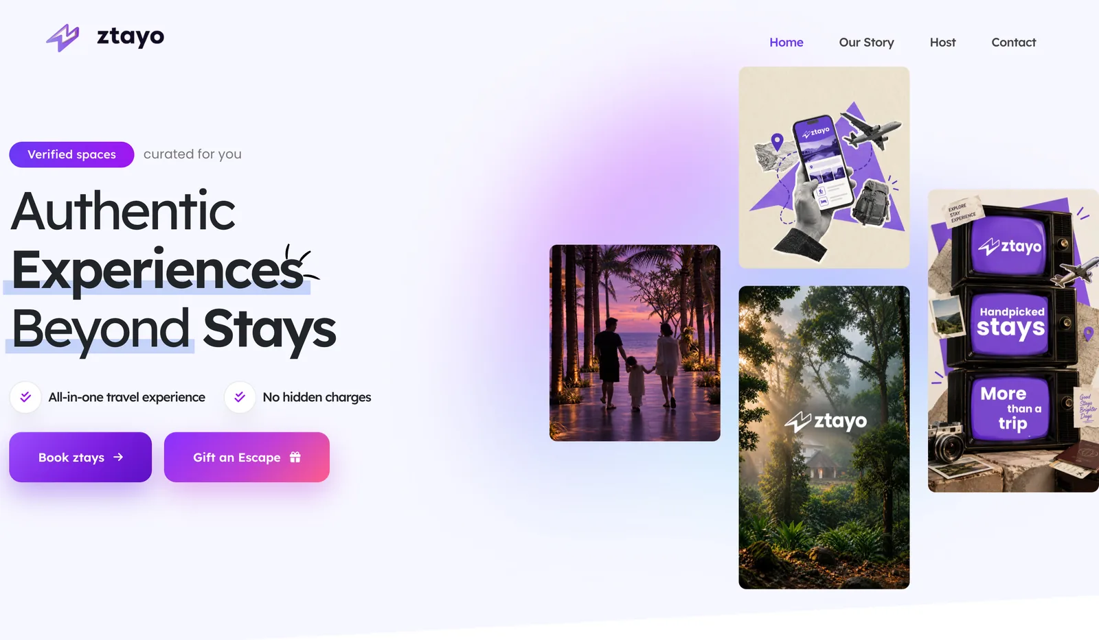
Stays, booked direct
Each offer gets its own section, written in the voice the guidelines set out.
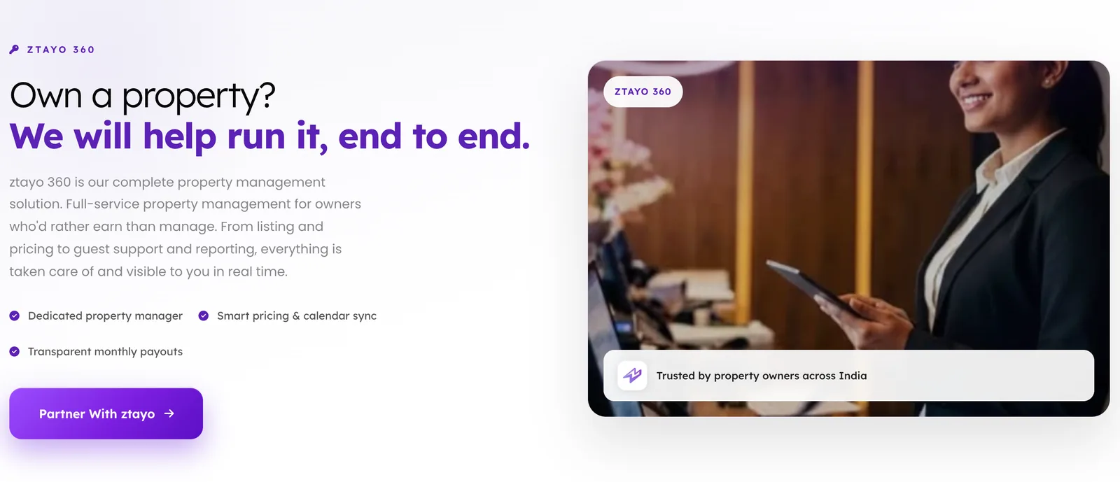
Two audiences, one brand
Guests and property owners are spoken to separately, so the same identity carries both the stay and the management service.
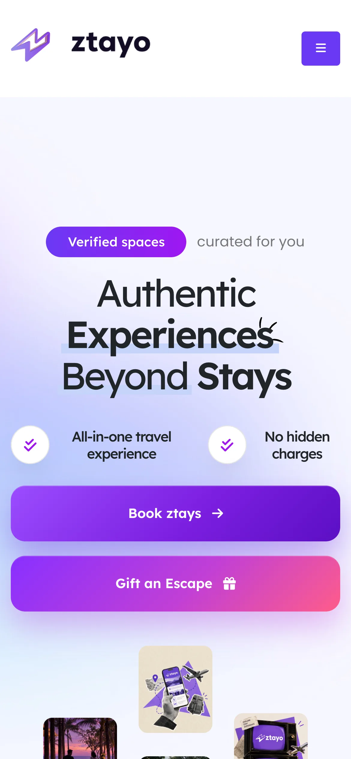
The same site, on a phone
The system holds on a small screen.
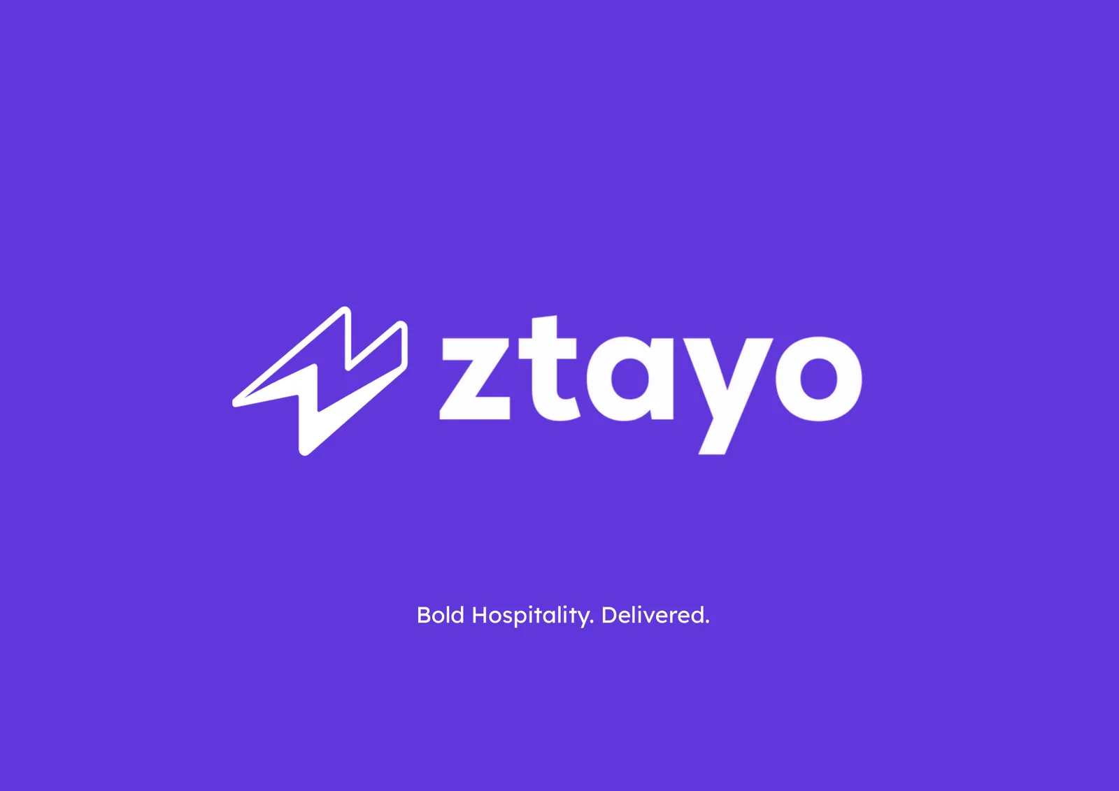
The brochure.
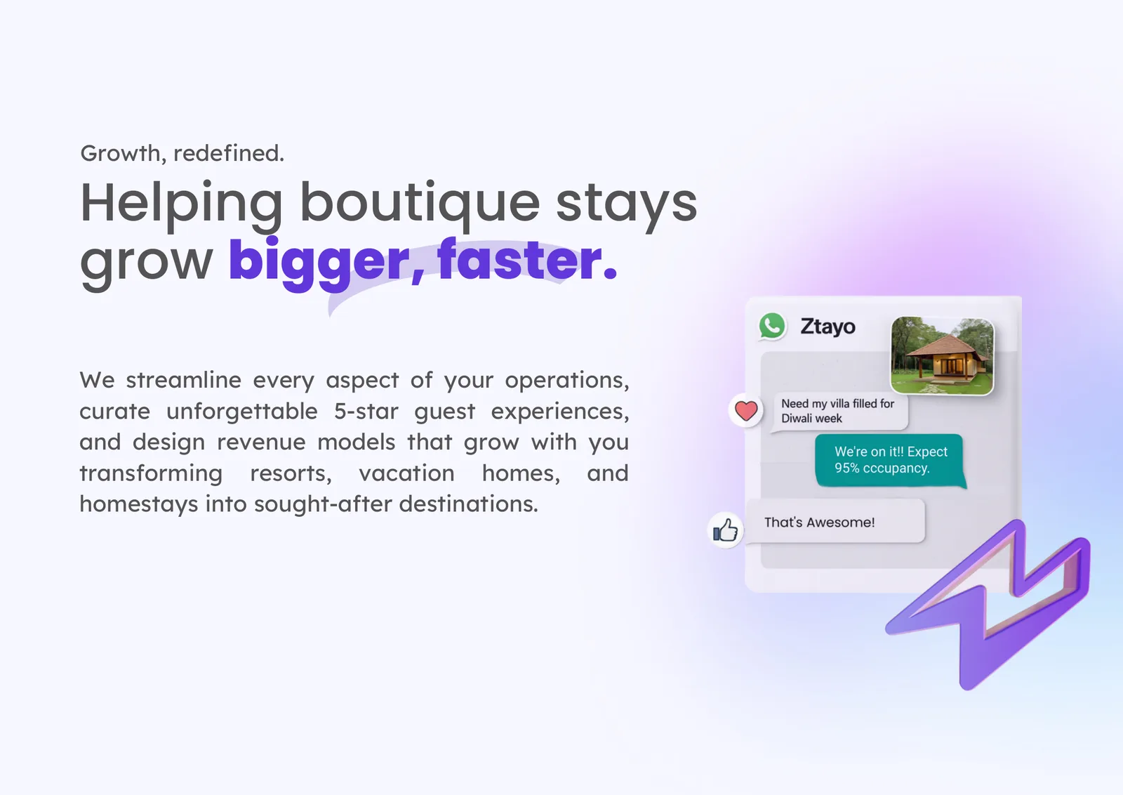
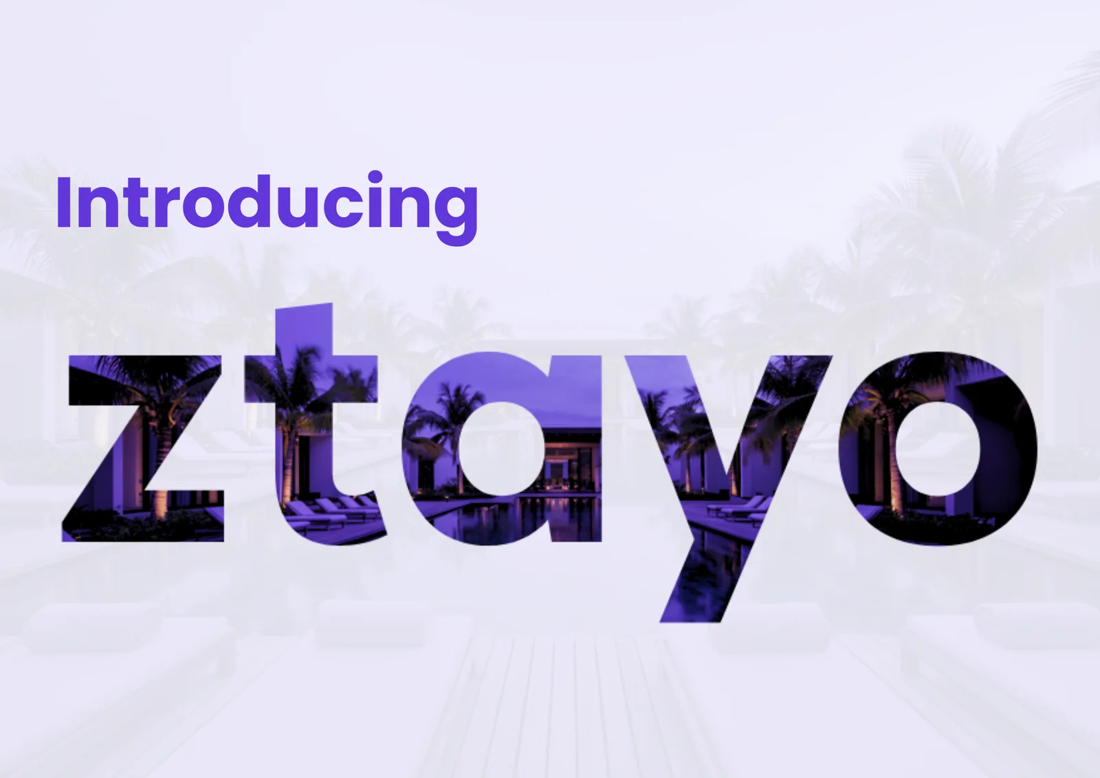
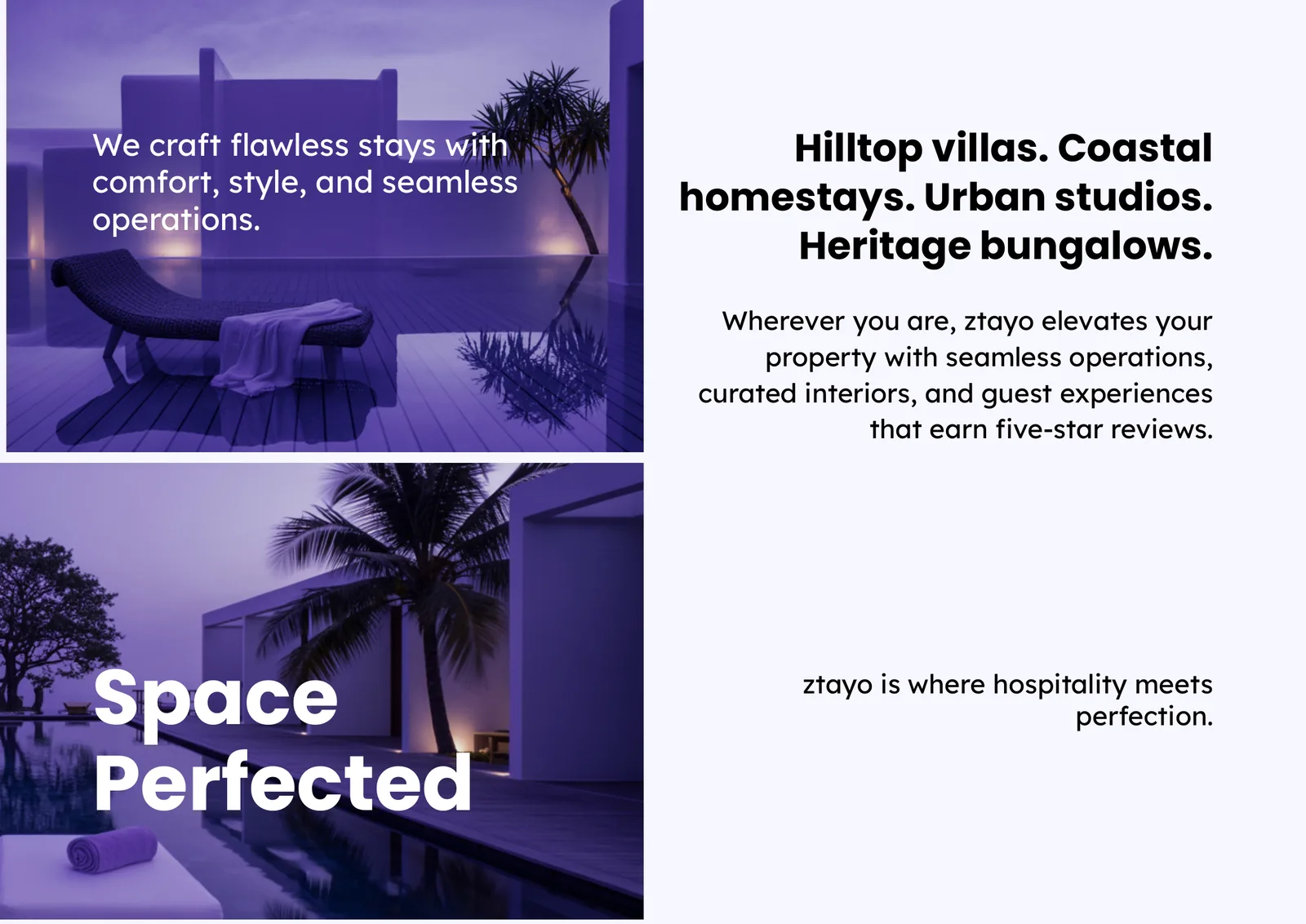
Twelve landscape pages that explain the business to property owners, in the same purples, type and lightning-bolt motif. Five of them, from the print file.
Brand applications
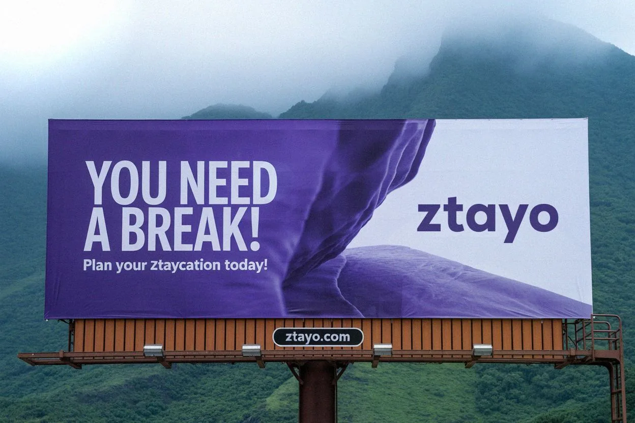
The campaign: “You need a break.” 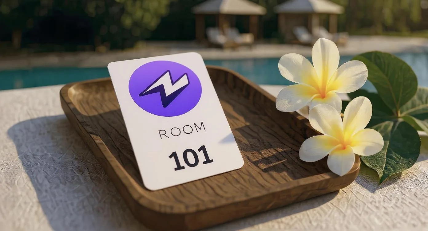
Guest touchpoints.
Applications, shown as concepts.
In the client’s words
Pixnut brought clarity and character to the way we wanted ZTAYO to be seen. They went beyond designing a logo to create a visual identity that felt intentional, consistent and true to the brand we wanted to build.
On recordWhere each claim on this page comes from.
- DeliveredPositioning, voice, visual identity and brand guidelines.The ZTAYO brand guidelines, written and delivered by Pixnut.
- DeliveredZTAYO.com, designed and built.Live at ZTAYO.com; captures taken from the running site.
- DeliveredA twelve-page brochure for property owners.The print file.
- ConceptBillboard, key card and mug applications.Shown as brand applications, not as documented deployments.
- Not claimedBookings, revenue or growth after launch.No post-launch results are on record.
Related
How this kind of work is done.
Next project
Keep looking.

Have a project like this?
Tell us about the brand and what it needs.