
Zero-to-One Brand Creation
Migorb
Building a brand from the ground up.

Different services. One recognisable identity.
- Client
- Migorb: study abroad, migration services and a language academy.
- Engagement
- Zero to One, end to end, across all three service families.
- Pixnut’s role
- Brand, identity, website, digital communication, social content and print.
- Status
- Historical project.
A venture our founder helped run as part of its leadership, and branded from the inside.
The question
How does a new brand with three different services, from language training to migration advice, stay recognisable as one?
Project
The brief.
Migorb was an education brand: IELTS and OET preparation, study abroad and migration services. Pixnut built it end to end: the initial brand, its identity, a website, digital communication, a weekly social content system and print collateral.
Alongside IELTS and OET preparation, Migorb offered study-abroad and migration services, so one identity had to hold a language academy and an advisory business together in print, on the web and in a weekly feed.
- Initial brand development
- Identity design
- Website
- Digital communication and a weekly social content system
- Supporting print collateral
Decisions
Key decisions.
- Identity
- A confident wordmark and a bright, friendly blue that reads clearly in a crowded feed.
- A content system, not campaigns
- Weekly carousel formats for each IELTS skill (listening, reading, writing and speaking), so the brand had a reason to be followed every week.
- Consistency
- Templates and characters reused across posts, so every piece is recognisably Migorb.
Identity
The marks.

WordmarkThe symbol takes the place of the O. 
SymbolThe mark on its own.
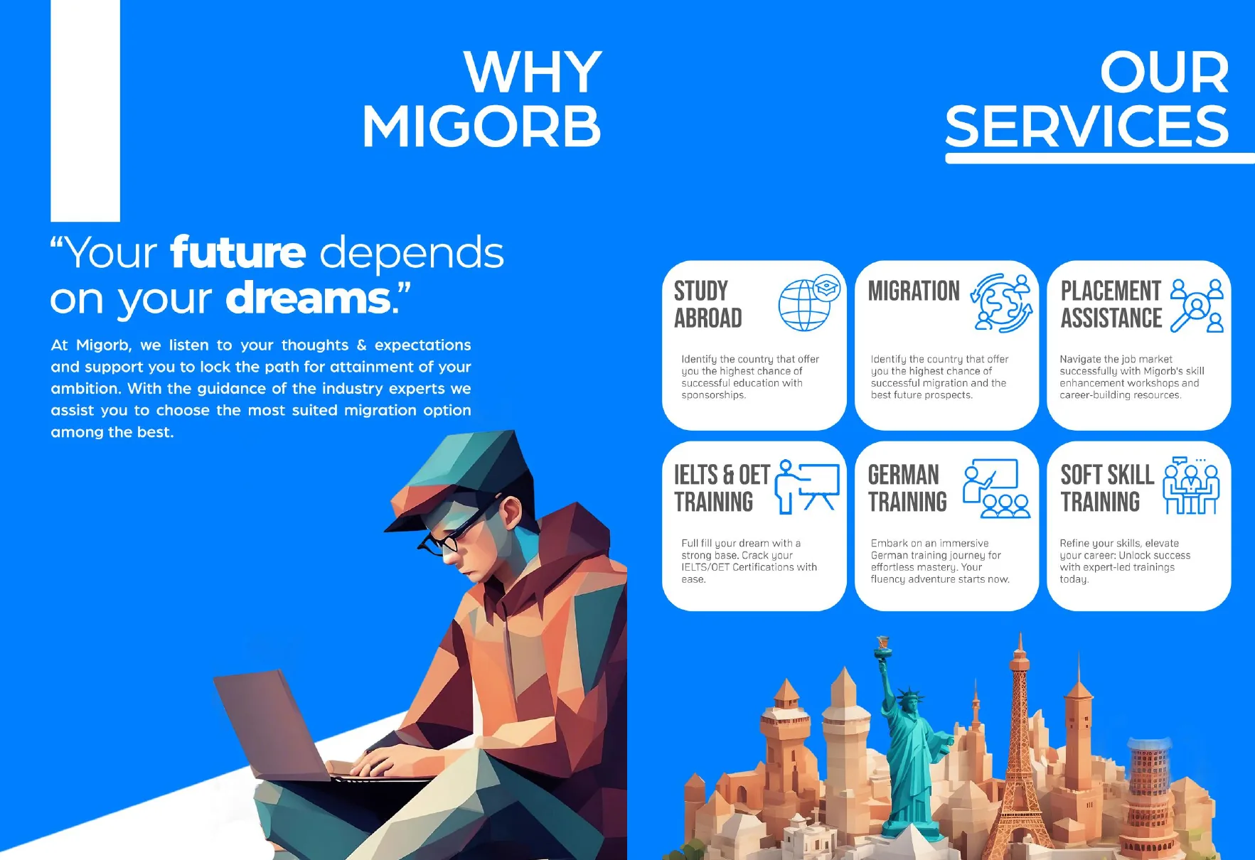
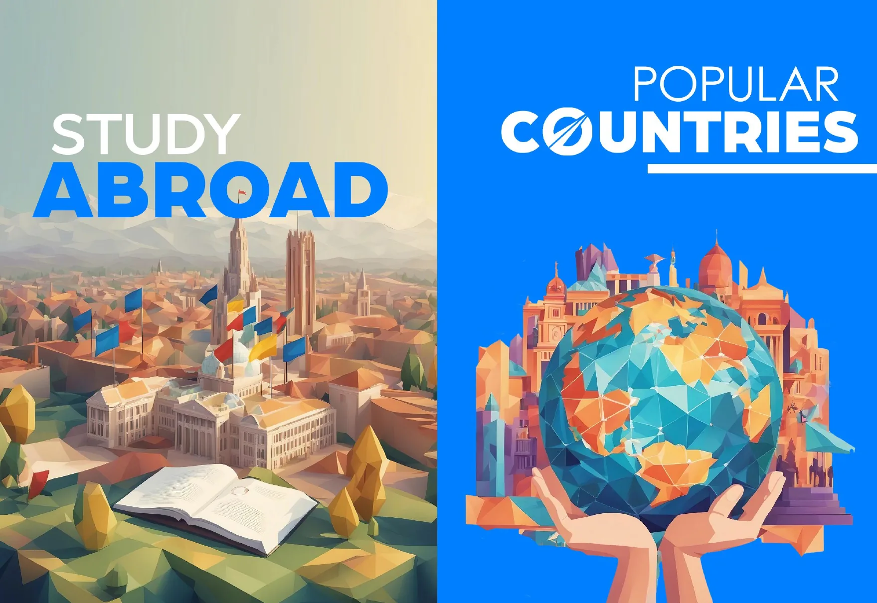
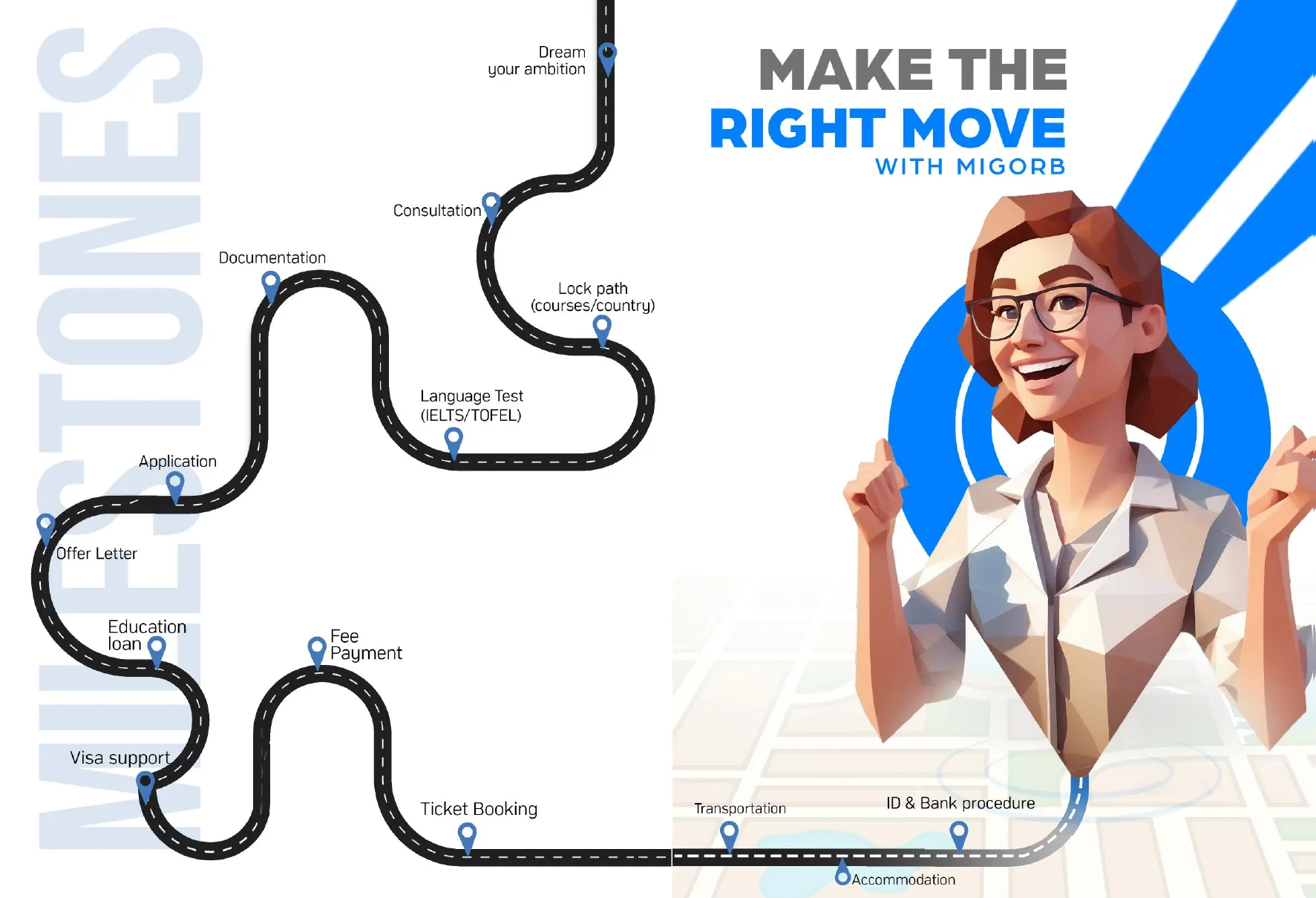
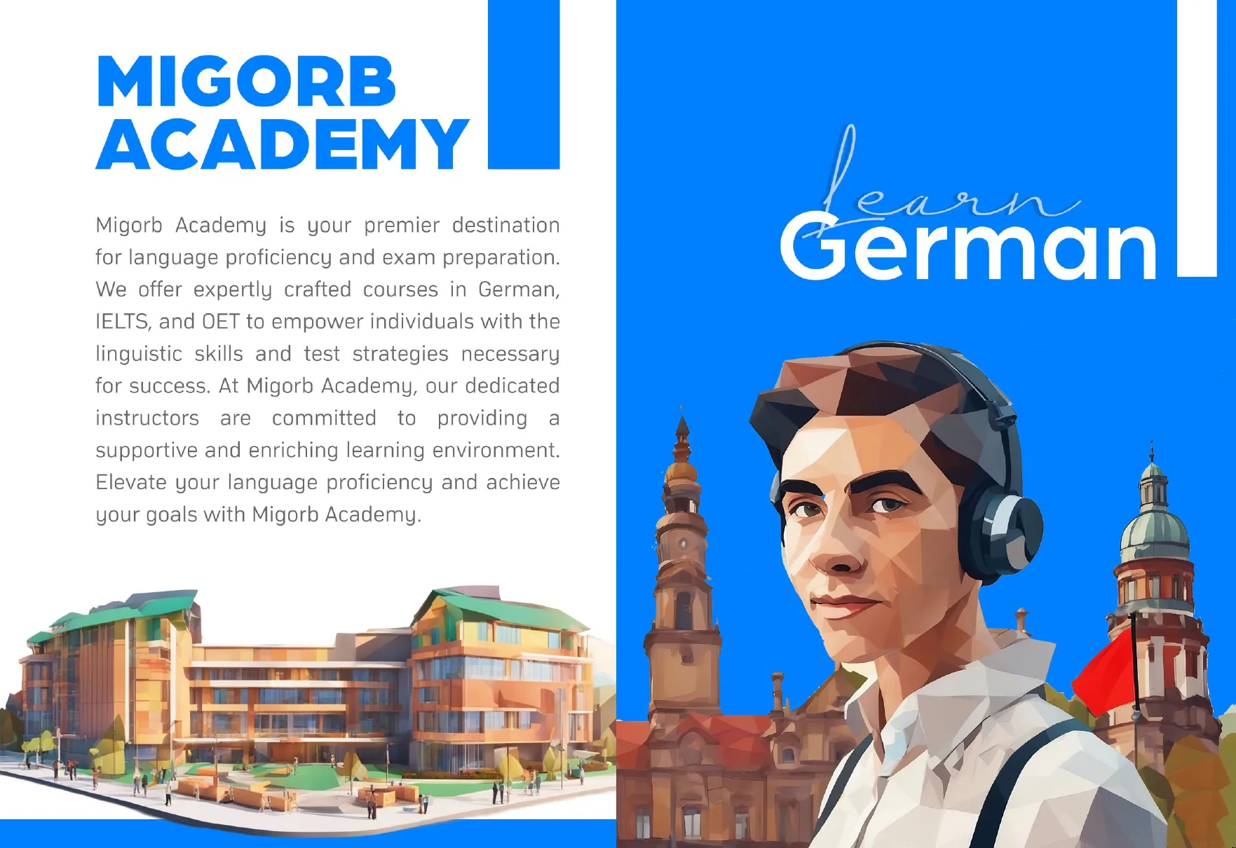
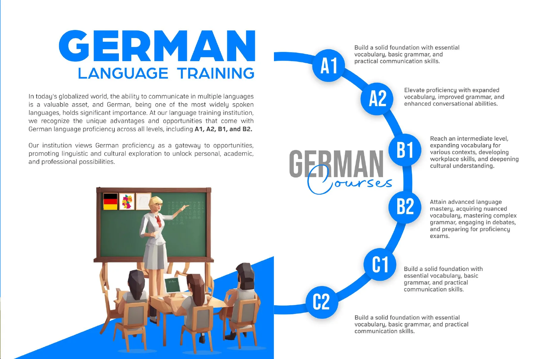
Twenty-eight pages, one system.
Three businesses in one brochure: study abroad, migration and the language academy. One blue, one low-poly illustration style and one way of opening every section hold them together. Five spreads from the printed original.
In the client’s words
Pixnut understood what we wanted Migorb to stand for and translated that into a clear, distinctive brand identity. What impressed me was the thought behind the work: every detail had a purpose, and everything felt like part of one cohesive brand.
On recordWhere each claim on this page comes from.
- DeliveredWordmark, symbol and colour system.The original logo files.
- DeliveredA 28-page brochure across study abroad, migration and the academy.The printed original (PDF, 2024).
- Not claimedStudents, enquiries or growth.No results are on record for this historical project.
Related
How this kind of work is done.
Next project
Keep looking.
Have a project like this?
Tell us about the brand and what it needs.