
Brand identity · Distinction in every detail
Brand identity design that holds together everywhere.
A name, a mark and a visual and verbal system people recognise, built to hold together on a screen, a billboard and a room key card.

The system
Rules that keep it recognisable.
An identity survives other people’s files only if the rules are clear. These are ZTAYO’s.
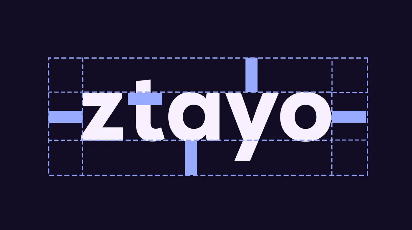
Colour
- Primary purple
#8830FFEnergy: the symbol and key moments. - Deep purple
#341263Grounding: backgrounds and depth.
Type
- LexendHeadings and emphasis.
- PoppinsBody text, with a defined hierarchy.
What the guidelines rule out

Don't stretch it 
Don't flip it 
Don't add effects 
Don't use busy backgrounds 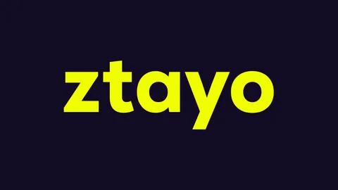
Don't recolour the wordmark 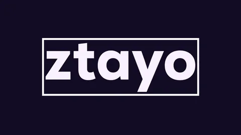
Don't box it in 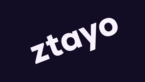
Don't rotate it 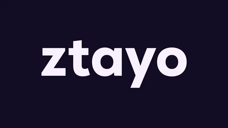
Use the wordmark as drawn
From the ZTAYO brand guidelines Pixnut wrote and delivered.
Identities in use
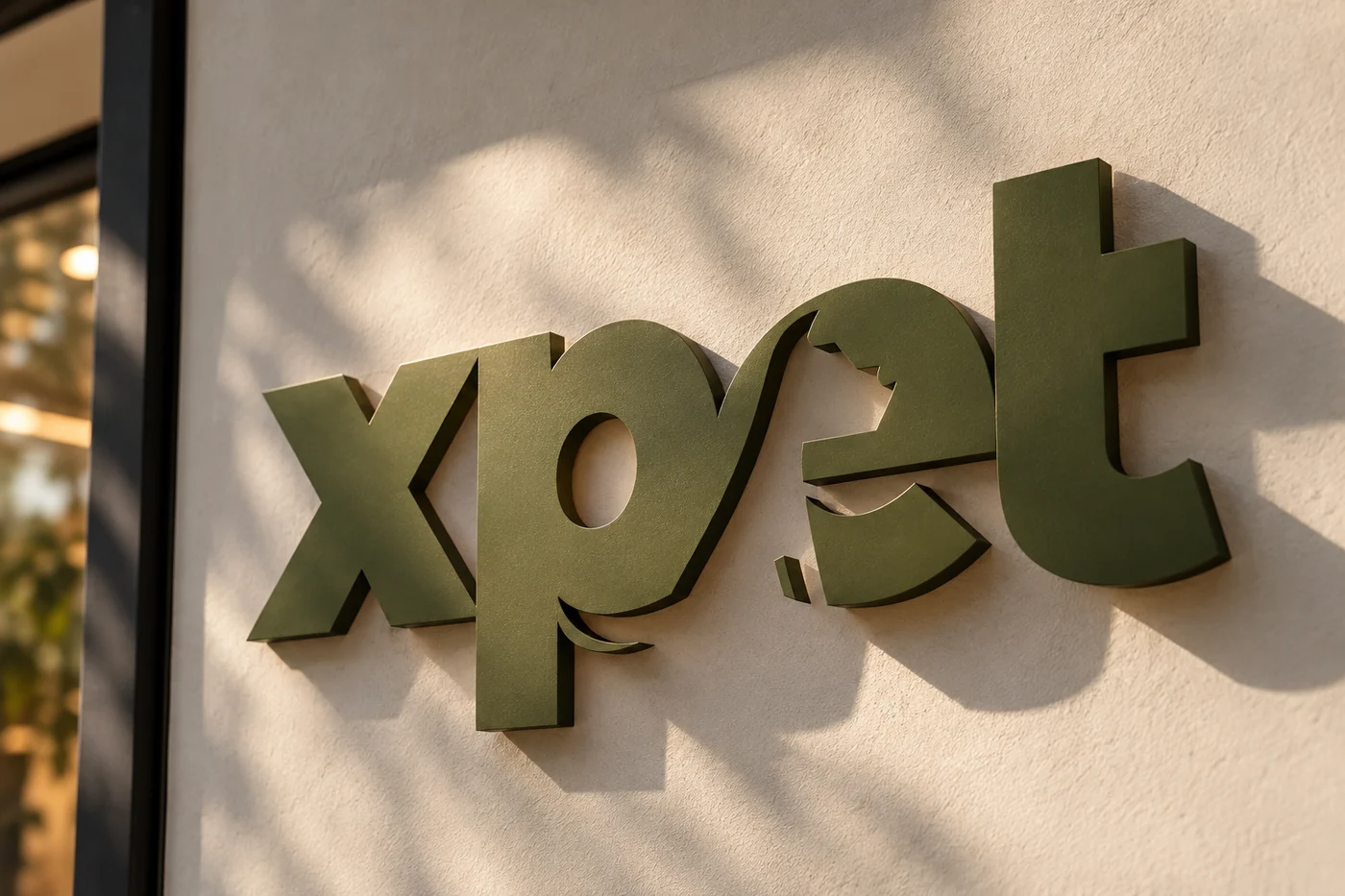
XPet: the name made physical. 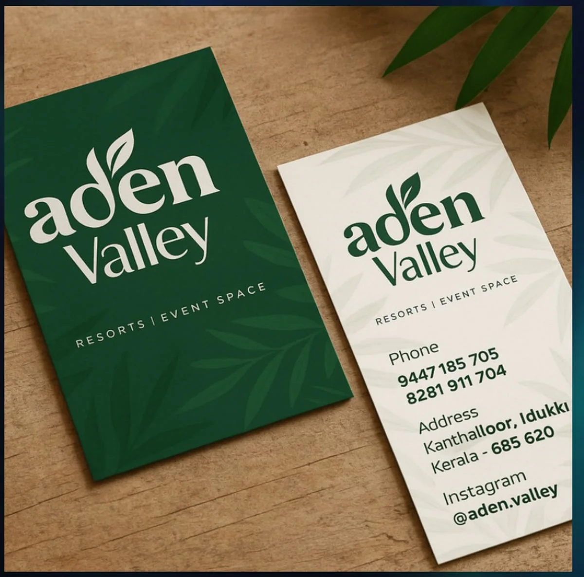
Aden Valley: identity on cards. 
XPet: packaging and print.
Identity applications, shown as concepts.
Selected identities
Marks we have drawn.
FarmTagIdentity. 
BlueSharkIdentity. 
ZorgaIdentity. 
AI-WAQF SummitEvent identity. 
REX EsportsIdentity. 
Kallada GardensIdentity.
Who it is for
For brands that need to be recognised, not just seen.
New brands
Businesses with a position and no visual or verbal identity yet, who want a name, a mark and a system built from the start.
Brands with a tired identity
Established businesses whose logo, colours and type have drifted or dated, and who need an evolution that keeps the recognition they have earned.
Growing teams
Companies where more people now produce brand material, and need guidelines and templates so everything still looks like one brand.
Brands moving into new formats
Businesses adding packaging, signage, a website or video, where an identity designed for one medium now has to work across many.
Signs you need it
When the identity is not doing its job.
- Your logo looks different on the website, the signage and the invoice.
- Nobody can say which colours or typefaces are correct.
- Suppliers ask for the logo file and you are not sure which one to send.
- The identity was designed before the business knew what it stood for.
- Your brand looks less established than your competitors, though the business is not.
- You are launching something new and need it to look right from the first day.
- The identity works on paper but breaks down on a phone screen or in a social post.
How it runs
From the idea to the system.
An identity follows the strategy, so every design choice has a reason a team can explain.
Brief
We start from the position: what the brand stands for and who it must speak to. If no strategy exists yet, we write the short version first.
Name, where needed
A name is developed from the position, checked for how it reads and sounds, and chosen with you, ready for your legal adviser to clear.
Directions
We explore the mark, colour, type and voice, then present a small number of directions with the reasoning behind each.
System
The chosen direction is built into a full system: logo versions, clear space, colour values, a type hierarchy and the rules for the voice.
Guidelines and applications
Everything is written into brand guidelines and applied to the touchpoints that matter, from print to digital, with final files and templates handed over.
What you receive
One identity, one system.
Scoped to the brand. The proposal lists what yours includes.
| Deliverable | What it is for |
|---|---|
| Naming, with the reasoning | Gives the brand a name that fits the position, with the thinking recorded. |
| Logo and symbol | The marks people recognise, drawn for every size and surface. |
| Colour, type and voice | The palette, typefaces and tone that make the brand consistent. |
| Brand guidelines | The rules for using all of it, so the brand survives other people’s files. |
| Templates | Ready-made formats your team can use without starting from scratch. |
| Applications, print to digital | The identity shown on the touchpoints where people will meet it. |
- A hospitality and property-management brand, built from zero.
- Positioning and voice came first, then the identity: the Z symbol, the wordmark, two purples, Lexend and Poppins.
- Brand guidelines with clear space, colour, type and the rules for what not to do, as shown above.
- The identity carried into marketing, creative direction and the website.
Pixnut brought clarity and character to the way we wanted ZTAYO to be seen. They went beyond designing a logo to create a visual identity that felt intentional, consistent and true to the brand we wanted to build.
In short
Brand identity design, end to end.
Brand identity design covers naming, the logo and symbol, colour, typography, the verbal identity and the guidelines that keep it all consistent, as in the ZTAYO system above. Identity work normally follows a brand strategy, so every design choice has a reason a team can explain.
Questions
Before you start.
What does a brand identity include?
What is the difference between a logo and a brand identity?
Should brand strategy come before identity?
Can you redesign our logo without changing everything?
Can Pixnut name a new brand?
What is included in brand guidelines?
Who owns the identity when the project ends?
Do you work with businesses outside India?
Need an identity that holds together?
Tell us about the brand and where it will appear. Book a call, or start with the Brand Health Check.